

Model 1
Model 2
📏 Pixels to REM Converter Tool – Complete Guide
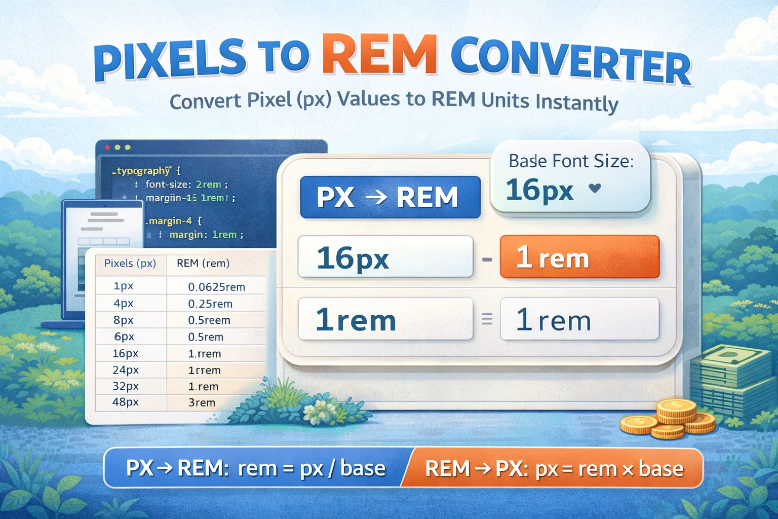
The Pixels to REM Converter is a simple and powerful tool designed for web developers, designers, and WordPress users who want to convert pixel (px) values into rem units instantly.
In modern responsive web design, using rem instead of pixels is highly recommended because rem values scale automatically based on the root font size. This helps create layouts that adapt better across different screen sizes and accessibility settings.
With this converter, you can easily switch between:
- PX → REM
- REM → PX
Table of Contents
⭐ Features of the Pixels to REM Converter
This tool includes all the essential features needed for accurate conversions:
- Convert pixels to rem instantly
- Convert rem back to pixels
- Adjustable base font size (default is 16px)
- Custom decimal rounding for precision
- Responsive design (works perfectly on mobile)
- Useful for CSS typography, spacing, padding, and layouts
🧮 How PX to REM Conversion Works
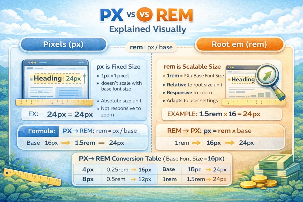
The conversion formula is very simple:
PX → REM Formula
REM=Base Font SizePX
REM → PX Formula
PX=REM×Base Font Size
📌 Example Calculation
If your base font size is 16px:
- 16px = 1rem
- 32px = 2rem
- 24px = 1.5rem
This makes rem units extremely useful for scalable typography and responsive UI design.
✅ PX to REM Conversion Table (Base Font Size = 16px)
Below is the standard conversion table used in most CSS frameworks like Bootstrap and Tailwind.
| Pixels (px) | REM (rem) |
|---|---|
| 1px | 0.0625rem |
| 2px | 0.125rem |
| 4px | 0.25rem |
| 6px | 0.375rem |
| 8px | 0.5rem |
| 10px | 0.625rem |
| 12px | 0.75rem |
| 14px | 0.875rem |
| 16px | 1rem |
| 18px | 1.125rem |
| 20px | 1.25rem |
| 22px | 1.375rem |
| 24px | 1.5rem |
| 26px | 1.625rem |
| 28px | 1.75rem |
| 30px | 1.875rem |
| 32px | 2rem |
| 36px | 2.25rem |
| 40px | 2.5rem |
| 44px | 2.75rem |
| 48px | 3rem |
| 52px | 3.25rem |
| 56px | 3.5rem |
| 60px | 3.75rem |
| 64px | 4rem |
| 72px | 4.5rem |
| 80px | 5rem |
| 96px | 6rem |
| 112px | 7rem |
| 128px | 8rem |
Base Font Size Variations
Examples: 16px vs 18px vs 20px
| PX | REM (Base 16px) | REM (Base 18px) | REM (Base 20px) |
|---|---|---|---|
| 16px | 1rem | 0.89rem | 0.8rem |
| 20px | 1.25rem | 1.11rem | 1rem |
| 24px | 1.5rem | 1.33rem | 1.2rem |
| 32px | 2rem | 1.78rem | 1.6rem |
| 40px | 2.5rem | 2.22rem | 2rem |
Common CSS Spacing Examples
| CSS Use Case | PX Value | REM Value |
|---|---|---|
| Small text | 12px | 0.75rem |
| Normal text | 16px | 1rem |
| Heading (H2) | 32px | 2rem |
| Button padding | 20px | 1.25rem |
| Section spacing | 64px | 4rem |
🎯 Why Use REM Instead of PX?
Using rem units offers many benefits:
✅ Better accessibility (users can scale fonts easily)
✅ Responsive design becomes easier
✅ Consistent sizing across devices
✅ Preferred in modern CSS frameworks
✅ Helps maintain scalable typography
Real CSS Code Snippet
html {
  font-size: 16px;
}

h1 {
  font-size: 2.5rem; /* 40px */
}

p {
  font-size: 1rem; /* 16px */
}

.container {
  padding: 2rem; /* 32px */
}
👨💻 Who Should Use This Tool?
The Pixels to REM Converter is perfect for:
- Front-end developers
- UI/UX designers
- WordPress theme builders
- CSS learners
- Responsive design projects
🚀 Final Thoughts
The PX to REM Converter makes it easy to convert pixel values into scalable rem units for responsive and modern web design. Whether you’re adjusting typography, padding, margins, or layout spacing, this tool helps you work faster and more efficiently.
Find more Alpha Calculators here.
Disclaimer: The tool was made with the help of AI Studio
FAQs
Q1. What does REM mean in CSS?
REM stands for “root em” and is based on the root font size.
Q2. Why use REM instead of PX?
REM helps create scalable, responsive, accessible designs.
Q3. What is the default base font size?
Most browsers use 16px as the default base size.
Q4. Is REM better for mobile?
Yes, because it adapts better to different screen sizes.